iOS 26 Developer Beta 3 – What’s New & How to Try It
Apple just dropped iOS 26 Developer Beta 3 on July 7, 2025, giving developers and early testers another peek at what’s in store for the fall release. This version isn’t a revolution. It’s definitely a recalibration. It shows Apple smoothing over its earlier rough patches while also responding, sometimes dramatically, to user feedback. With this third beta, the tech giant has made a handful of strategic decisions that affect everything from aesthetics to accessibility, and it’s sparked quite a conversation in the Apple community.
Let’s dive into what’s changed, what’s improved, and what some feel has taken a surprising step backward.
1. Liquid Glass Gets the Nerf Treatment
The biggest story out of Beta 3? Apple has dramatically reduced transparency in its much-hyped Liquid Glass UI elements. Navigation bars, buttons, tabs, even Control Center, now appear thicker, denser, and noticeably more opaque. Beta 3 makes these elements appear more solid to enhance readability. It is effectively backing away from the eye-catching (but sometimes impractical) glass-like aesthetic introduced earlier in iOS 26.
User Reactions:
“iOS 26 beta 3 completely nerfs Liquid Glass… It looks so much cheaper now and feels like Apple is backtracking on their original vision.”
— supremedesigner on MacRumors
“Not sure why they dialed Liquid Glass down so much… Man, liquid glass totally got nerfed in beta 3.”
— multiple commenters on X
And then there’s Mark Gurman, who didn’t hold back:
“It is incredible that Apple design decisions developed over multiple years can be influenced by a week of Twitter and YouTube commentary.”
Later on X, he wrote:
“Announce a huge redesign just to throw much of it away. Apple should be allowing users to choose how much glass they want instead of just reversing by 75%. At least rename it now to Frosted Glass. Lol.”
The design community is split. Some argue this shift increases legibility and accessibility, particularly for users with visual impairments or those viewing screens in bright environments. Others see it as a major retreat from Apple’s initial design vision.
This isn’t a gentle tweak. It’s a sharp pivot, and developers are taking notice. As one Apple Forums user noted, “most of the liquid glass has been removed … defeats the whole purpose of a big redesign.”
The takeaway? Apple’s trying to strike a better balance. In the process, it’s walked back a visual identity it just launched.
2. New Wallpaper Variants

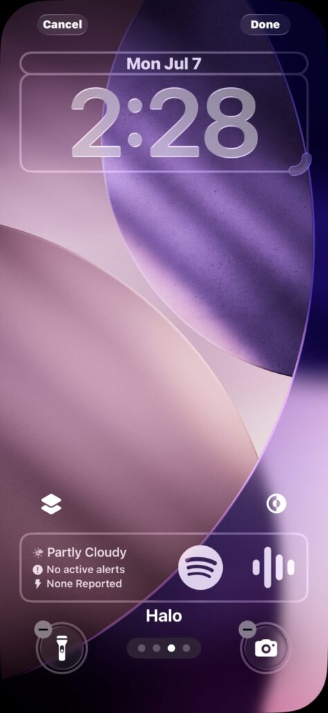

To soften the blow of the Liquid Glass nerf, perhaps, Apple has added four new wallpaper color options: Halo, Sky, Shadow, and Dusk. These versions carry the same ethereal vibe as the default iOS 26 wallpapers but offer a more personalized range of contrast and mood. They seem designed to complement the now-subtler UI, providing visual interest without overwhelming the user interface.
Fans of minimalist design may especially appreciate the Shadow and Dusk themes. They provide darker palettes ideal for OLED displays and nighttime usage.
3. UI & System Tweaks
The changes in Beta 3 aren’t limited to aesthetics. Apple has also delivered subtle, behind-the-scenes refinements that enhance usability and consistency:
- Control Center: Improved color balance and contrast make icons pop better against their semi-transparent backgrounds.
- Safari’s address bar: Now features a clearer frosted glass look, making it more distinct from the content below.
- Lock Screen widgets: These now remain visible at all times instead of fading in and out based on ambient brightness or touch.
- Dock icon spacing: Ever so slightly improved to better align app icons and remove the awkward misalignment some users noticed in Beta 2.
They’re small changes. Still, they reflect Apple’s meticulous approach to UI refinement. They fix things you didn’t know were broken until they got better.
4. iPadOS 26: Cursor Shake Enhancement
For iPad users, Beta 3 introduces a welcome accessibility improvement: a cursor enlargement trigger. Shake your mouse or swipe quickly on the trackpad, and the cursor momentarily grows in size. It’s a small touch, but a meaningful one, especially for users who multitask with external displays or frequently lose sight of the pointer.
This feature mimics macOS behavior. It suggests Apple is continuing to blur the line between desktop and tablet functionality without overwhelming the core iPad experience.
5. Bug Fixes & Other Refinements
No beta would be complete without a round of bug squashing. Beta 3 addresses several annoying issues:
- Maps: Offline mode now handles fog advisories more accurately.
- Safari: Managing bookmarks within folders no longer causes random crashes or sync delays.
- External display support: Video calls now run more reliably when the iPad is docked or connected to a monitor. This is a key fix for remote workers.
While not flashy, these fixes go a long way in making the OS feel stable enough for daily use. Still, it’s not quite ready for the faint of heart.
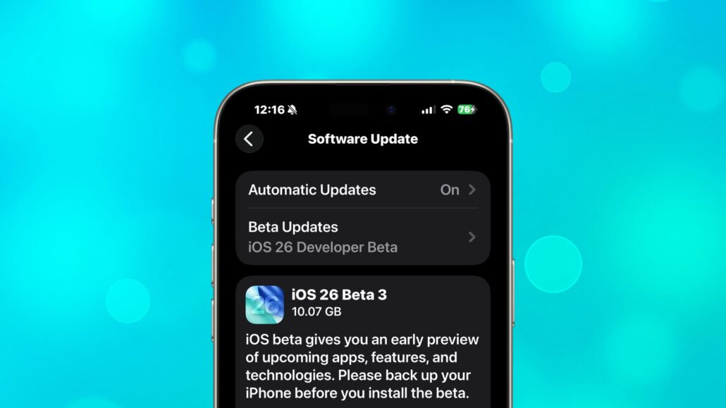
6. How to Download/Install
If you’re a registered developer, getting your hands on iOS 26 Developer Beta 3 (build 23A5287g) is simple. Just go to Settings > General > Software Update and follow the prompt.
Don’t have a dev profile? Sit tight. Apple says the public beta is expected to launch in mid-July. It’ll likely contain most of the features seen here, but with more stability and fewer experimental changes.
7. Developer vs Public Beta: What to Expect
Developer betas are rough drafts of Apple’s vision. They’re meant for testing, feedback, and feature experimentation. They do not guarantee stability. The public beta, however, is curated for a broader audience. It focuses more on performance, battery life, and security.
If you’re curious and can tolerate the occasional bug, the developer beta might be fun. But if you’re not into surprise crashes or battery drains, waiting for the public beta (or even the final release) is probably smarter.
Final Thoughts
iOS 26 Developer Beta 3 feels like a course correction. It continues to polish iOS 26’s look and feel. The dramatic pivot on Liquid Glass is telling. Apple seems caught between innovation and usability. This beta suggests usability is winning for now.
Some users welcome the toned-down visuals. Others are frustrated that the bold aesthetic showcased just weeks ago is already being muted. Whether Apple plans to reintroduce adjustable transparency or double down on its frosted detour remains to be seen.
Either way, one thing is clear. The beta process is alive and kicking, and your feedback still matters. Are you testing iOS 26 Developer Beta 3? What’s your favorite change or biggest letdown? Drop a comment below and let us know.


Leave a Reply
Want to join the discussion?Feel free to contribute!